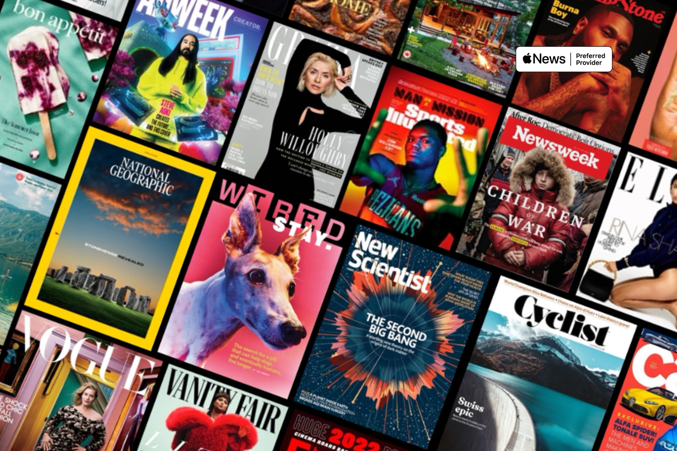
Imagery That Engages: Getting the Most Out of Photography and Graphics in Apple News

In today’s digital age, thinking about how your print content translates to the web is crucial, particularly on platforms such as Apple News.
Apple News+ sets itself apart by having editors (actual real-life humans!) who actively seek visually appealing, high-quality content to share with their readers.
By prioritizing the quality of your visual assets in Apple News, you can attract a global audience and increase revenue opportunities.
In this article, we’ll delve into the art of transforming your static magazine pages into immersive, media-rich digital experiences. Let’s get started!
A seamless transition from print to digital
If your primary focus is on the aesthetics and layout of your magazine’s print edition, you may not be thinking about the next step.
You might choose to skip the optimization step and save time by uploading your print content as PDFs to Apple News. However, a read-only experience without Apple News’ interactivity won’t deliver the impact that optimized content can achieve.
It’s worth investing the time and resources to ensure your content shines across all devices. Here’s how!
Editing your images
- Product images must have a transparent background to transition between light and dark modes seamlessly. This way, readers won’t see unsightly white backgrounds around images when switching modes.
- Maintain a polished appearance as readers scroll through your content. Avoid cramming oversized print images into web articles or mixing inconsistently sized images.
- In cases where images are smaller in print than digital (e.g., editor headshots), source higher-resolution quality images to achieve the best results on screen.
- Consider breaking print image collections into standalone images so readers can tap and engage with each one, increasing interactivity.
- Retouch images that may have been partially hidden or obscured in print, ensuring they deliver their full visual impact.
Presenting your images
In Apple News, you can choose from four layouts: gallery, mosaic, hero and standalone. How you present your images can significantly impact the overall user experience.
- Galleries are ideal for showing a series of related images, allowing your readers to swipe through a collection.
- Mosaic layouts are a visually appealing way to present a group of images together.
- Hero headers are large, attention-grabbing images that can set the tone for your content and draw readers in.
- Standalone images can be tapped and explored individually.
Whatever style you choose, ensure the subject or essential elements aren’t cropped out in your selected layout.
Improving user engagement
- To help readers digest information more quickly, break up long paragraphs of text by placing images within the copy.
- Decide whether an image should be tappable or not. Tappable images encourage reader interaction, leading to additional content or actions.
- Consider the placement of captions: directly under the image to provide immediate context or tappable, revealing additional information with a tap.
Considering an external supplier
Leveraging your team’s strengths and outsourcing specialized expertise can be a smart way to achieve your desired results without needing a full-time, in-house team.
An Apple News specialist team can craft custom editorial templates that capture your print magazine’s style. They handle the extraction and placement of text and images, ensuring digital quality matches the print version. As well as the flexibility to enhance your content with video, audio, social links and subscription options to make it more engaging and appealing to new readers.
But, before you decide to engage an external provider, it’s essential to check their credentials. Are they an accredited Apple News Preferred Provider?
Just like any service provider, there’s a significant distinction between high and low-end options. Some providers may claim to deliver content in the Apple News format, but they often lack the hands-on approach, with many simply clipping images and inserting them directly into pre-existing templates.
Taking shortcuts on quality can lead to noticeable differences in how your content appears across different mediums, so it pays to do your research.
As an Apple News Preferred Provider with experience working on 175+ publications across North America, the UK and Australia, we’re here to help.
Ready to transform your content, boost earnings, and grow your audience? Contact us to unlock the full potential of your magazine in the digital age.


